How to make AI backgrounds
Here is how you make gorgeous background art:
1. The bigger the better?
Think about the size you will need: in my experience, smaller sizes tend to work better if you have complex wishes. You can later upscale with waifu2x or another tool. The maximum size you can currently set in NovelAI is just short of the standard game resolution of 1280x720. (If you need more without upscaling, you have to do your own experiments...) Depending on the type of background, upscaling could be perfectly fine: if you have some more romantic story, you anyway don't want the backgrounds to be too crisp, since you want your characters to stand out a bit.
Here is an example from a recent top anime you might know: Spy x Family. (If you don't know it, watch it. No discussion!) I have picked one where the background is highly detailed, but still you see that it is slightly blurred as compared to the main characters. Upscaling of the background wouldn't be any problem here.
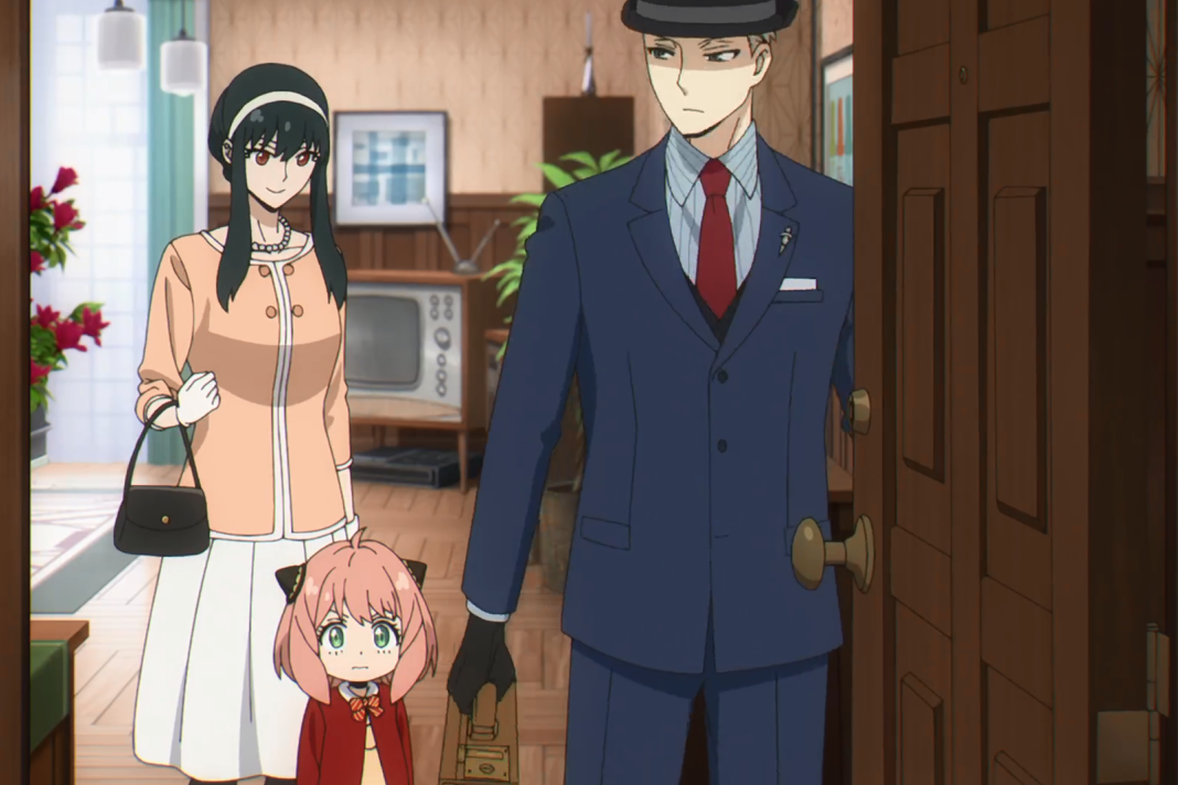 (Source: Crunchy Roll)
There are cases where it is not so good. For instance, when you don't have characters in the foreground, and want to have something highly detailed. That's a limitation you should know about.
2. Think about what you need!
Often, you don't have to be that particular. An example: You need a forest as background? Does it matter what kind of trees you will have there? Most of the time it won't. So let the AI decide for you! The AI is an artist, she wants to use her creativity, don't limit her too much or she gets grumpy and produces bad pictures.
There are some useful tags for you to know: "scenery" and "no humans". The latter one is particularly useful when the AI tries to be "nice" and starts putting sexy women into your picture because she thinks it would be boring without them. And yes, that happens! (I won't show you examples here.)
There are some other nice tags that make your background look more spectacular, e.g. "light rays" and "sunshine". A forest becomes livelier when you add "bushes", "flowers" or other things. As long as you add very generic items, the picture usually gets better. Think twice though about adding too special items. That might be too demanding for the AI-artist as she might not be that familar with it.
Here are some examples:
scenery, forest, autumn, bushes, flowers
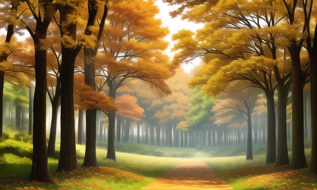
That worked well at only 22 iterations (seed=1). With more iterations you could probably make the picture looking more awesome. But let us now add too much stuff:
scenery, forest, autumn, bushes, flowers, mushroom, hut, fox,
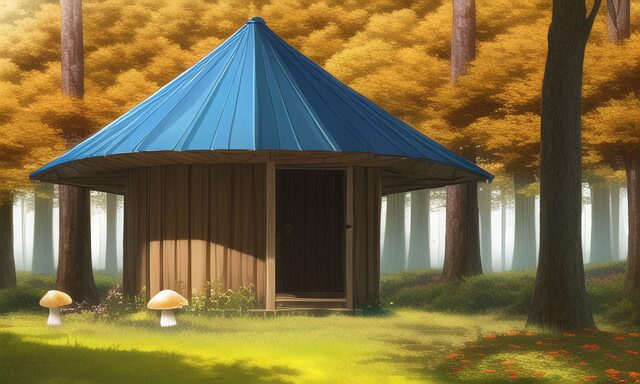
And here the hut suddenly merges with the mushroom (very creative idea of her), and the fox just got ignored, because it's just too much demands at once.
Let us instead try the beautification tags:
scenery, forest, autumn, bushes, flowers, sunshine, light rays,
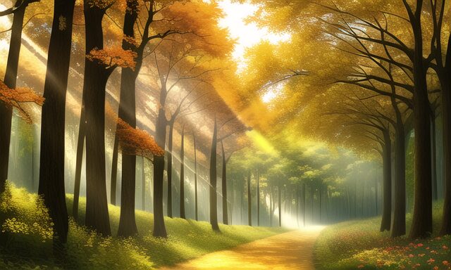
And, wow, what a nice effect! I think that picture looks already impressive. Now you could imagine your characters walking through the forest, and, being overwhelmed by the beauty surrounding them, falling in love with each other and living happily ever after... Ehem. Okay, I got a bit distracted, but in any case you see how it works.
3. You have more specific demands?
You want a house to look in a particular way? You want the lake to be on the right side of the image? You want to look down onto a forest? All these kind of demands are tricky and you will be in for a ride!
What are the methods with which you can enforce such wishes?
First, you can try with undocumented tags or descriptions. That surprisingly often works! Here is an example:
scenery, forest, autumn, view from top, aerial view
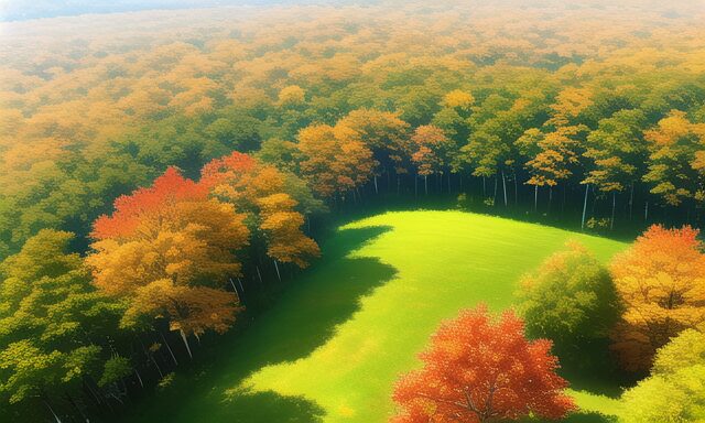
Looks like the AI got what you meant on the first try! You won't always be so lucky, though, that's why there are other methods.
Second method: if your picture consists of more than one element, then mix and mesh! The AI is, e.g, pretty good in drawing an animal. And it's good in landscapes. Both together – meh... But you can just copy paste, fiddle around with size and shades, add some leaves in front of the animal etc. and at the end get a good picture. Some things you will even draw by yourself or copy from photos. Take this example from my game "Sweet Science" where I hand-made the poster using a picture from the AI and icons from Keynote. The background art is all NovelAI, but I added manually some leave shadows on top of the poster in Procreate. Nice, isn't it?
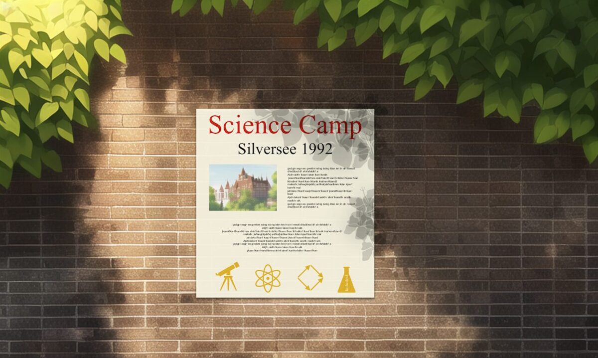
(And you see on this example: creativity is still needed when using an AI...)
Third method: use a different AI! DALL-E 2, e.g., is much better than NovelAI in understanding complicated or creative tasks. It just sucks at anime style. Sometimes, however, you can mesh pictures from both sources together like I did in the classroom picture above where parts were drawn by DALL-E 2, parts by Novel AI, parts by myself (e.g. the writing on the blackboard) and parts copied in from Wikipedia (the map of UK, credits in the game):
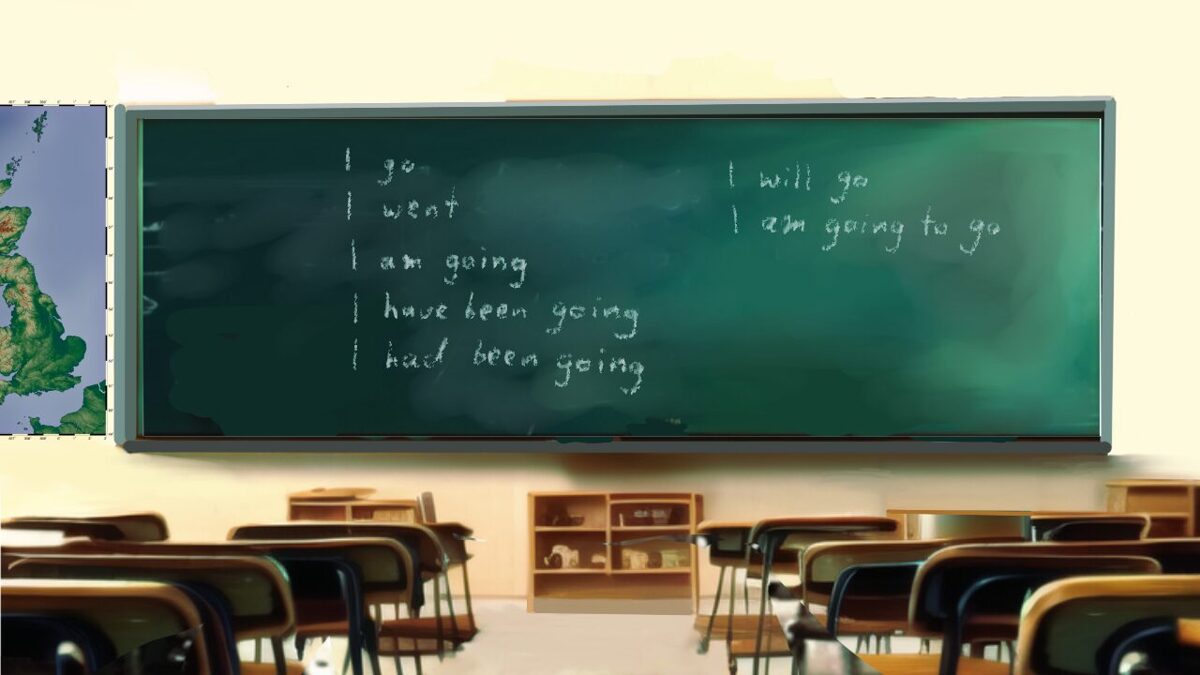
(It's supposed to look a bit gloomy, so don't worry if you don't like to be in this class room... ;-)
Fourth method: just produce a lot of pictures until one is fitting. Indeed, that is most often the method of choice! It sounds sad, but often there is no way to communicate your ideas to the AI and then that's one way to go. If after many attempts you still can't get anywhere close to your wishes, then there is one last hope:
Fifth method and last straw: upload a picture and ask the AI to draw something based on the picture! This function is hit and miss: you need to describe what is on the picture and it better be something that the AI knows about. If that's the case, you still have to find the right Strength-parameter: if it's too low, you might get a horrible version of the original pic. If it's too high, the AI might draw something that does not resemble the original anymore. It is also a rather const intensive way to make pictures, but sometimes the only way. I used it, e.g., in this picture where I wanted to have a view on Silversee Castle from the hill top with the lake in the background. I had taken the original photo by myself, and it was indeed a photo of a castle that is a boarding school on a big lake, but I'm not going to tell you where it is...
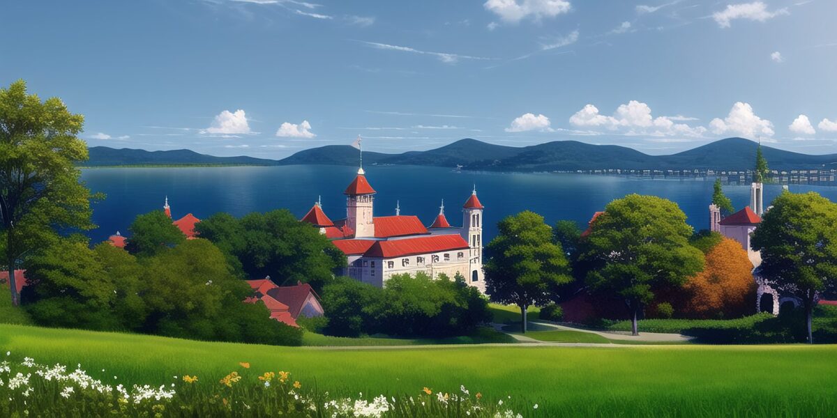
Oh, sorry, I forgot one last method: lower your standards!
The castle doesn't look the same on the second background picture? The classroom is too small, the trees too tall, the mountain too high? Who cares! If it's not too obvious, most players won't notice and the others will forgive you if the rest of the game is good. Trust in the players to fill in gaps with their own fantasy! There are tons of games where artists created graphics for games and produced glaring inconsistencies and still people liked the game! Here is an example from "Everlasting Summer" – a really good game that you should play if you haven't yet and a big hit (sorry for the bad resolution):
What's wrong about this picture? Well, nothing by itself, but here is another picture in the game of the lab and you can see that it gives a totally different vibe:
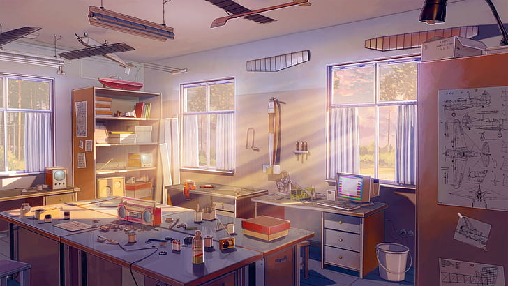
Here it looks as it should, since the game is set in the 1980s' USSR and the technology at the time is nicely reflected here. Really, a wonderful piece of background art. The one above, however, does not fit at all as it looks totally futuristic. (Maybe it was meant to be funny, but if it was, then you don't have to worry about any inconsistencies in your game either: you can just say they were meant to be funny as well...)
4. The AI is not an architect!
Proof: look carefully on the picture of the castle that we seen before: the walls really aren't straight... q.e.d.
Okay, but that is not the main problem, but the AI cannot draw the same building consistently from different angles, it struggles severely with geometry, in particular with complicated objects like chairs and tables, cannot produce technically correct paintings, e.g., of computers etc.
If you ever need something like that, you will have to do *a lot* of manual work. Or you can use the methods described in the last section: that was the reason, e.g., why I used DALL-E 2 for helping with the classroom picture (but even DALL-E 2 is struggling there a bit). Sometimes it helps to upload a template, which I did in some of these cases as well.
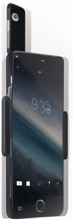
Sometimes nothing helps. I've mentioned in a previous blog entry that trying to get a picture of an old cell phone produced hilarious results (see below on the left). In this case: draw by yourself, use a photo or hire an artist (see below on the right).

5. Final tips
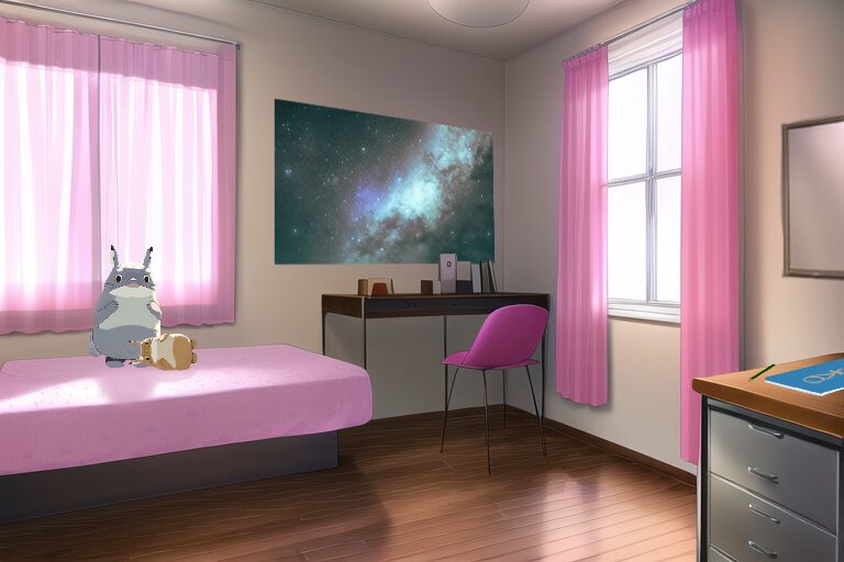
Add your personal touch by adding stuff! Stuff produced by the AI separately, stuff that you copy and paste, stuff that you draw or write. That can be a picture on the wall (made by DALL-E 2 or yourself), some light rays, a toy pasted in from another picture, NPCs added into the picture that you produce separately with Novel AI and copy in, a variation of the background at night where you adjusted the colours manually and also took out some of the light reflections and replaced them with lamp lights – your creativity can make all the difference!
Here's an example from "Sweet Science" where I've added a poster (Ai-generated), a folder and a pen (hand-drawn) and two AI-generated Totoro. Nice, isn't it?
And don't forget about the main recipe for great background art:
- Choose your motif wisely, with enough liberty for the AI artist!
- Choose your tags well. Be specific, but not too demanding!
- Use the methods I have explained to settle specific demands and if need be: simply reduce your demands: relax, it's just a game!
